Giant Food Font Exploration

Role
Principal Designer, Creative Leader
Timeline
3 months
Channel
Print, Digital, Signage, Communications / PR, Out of Home
Business Impact
Newly licensed fonts, Reduced licensing fees compared to existing fonts
Challenge
With corporate licensing expiring we needed to evaluate our font options to explore alternatives for Helvetica Neue to use in our weekly ad and all channels across the business. Due to the ad being the most limited for space constraints and legibility I was chosen to lead the charge of identifying our next font.
Objectives
Find a typeface that preserves Helvetica's space-saving clarity while offering a wider visual voice and creative flexibility.
During the exploration of new fonts there were a variety of limitations and constraints I had to consider when evaluating new fonts. Helvetica just had a way of checking all the boxes perfectly. Max and Eduard really knew what they were doing. Those constraints included tight letter spacing, line height, having a variety of weights, and of course readability. I’ll talk more about each of these constraints below and how the fonts in our final selection fared on accomplishing those goals.
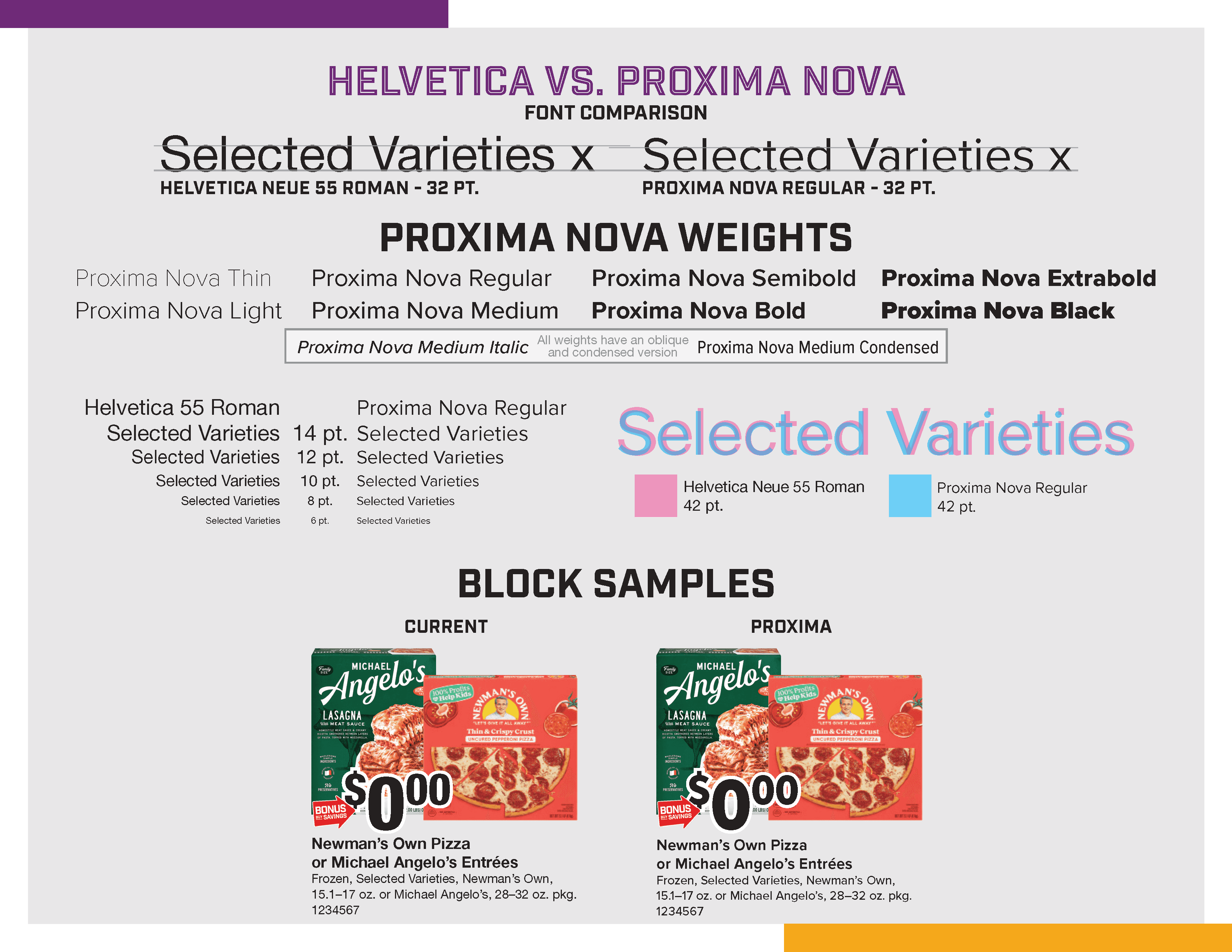
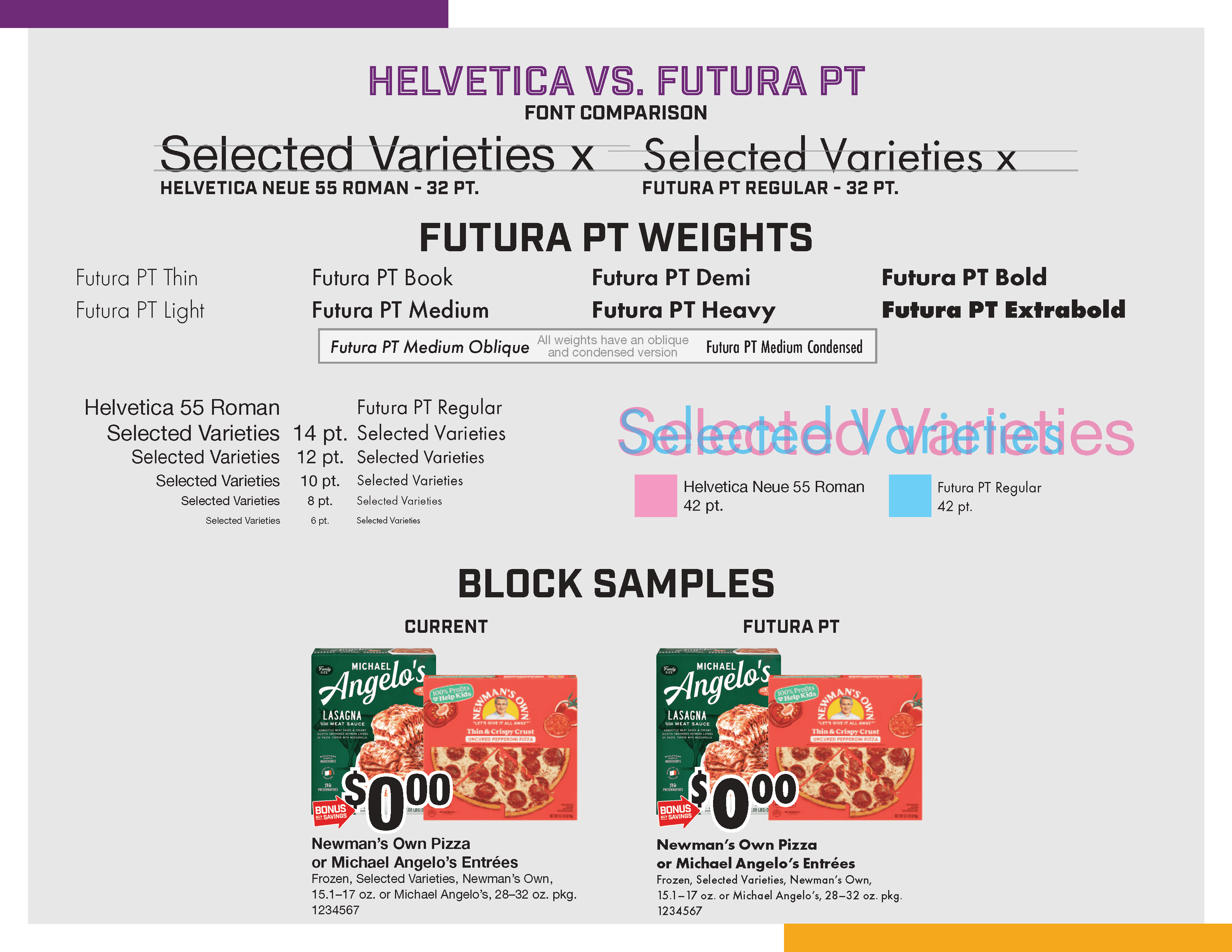
To help leadership and fellow creative stakeholders visualize the differences I devised an easy to read one-page graphic that showcases each font we considered and how it compares to Helvetica Neue.
Our list of contenders were quickly narrowed down to these 5 fonts:
Proxima Nova
Trade Gothic
Elza
Antique Olive
Futura PT


Letter Spacing
Space is always at a premium when working on a retail ad flyer. Wide fonts do not work and force the text to spread across more lines. I needed a narrow font family that matched Helvetica’s spacing, ideally with a condensed version. An additional concern was how well our next font reproduced in print. Our ad is printed on the lowest grade of newsprint by large web presses. This type of printing is prone to “Plugging” where the counters and bowls of letters fill in with ink. The new font needed to have larger, open counters and bowls to combat this possibility.
Line Height
While working within the space constraints of letter spacing I sought fonts that had a taller x-height. Using fonts with a taller x-height helps the design of our pages feel more open instead of cramped and tight. Additionally, the taller x-height helps readability at smaller font sizes, which we rely on heavily with our smaller sale items.
Letter Spacing
Space is always at a premium when working on a retail ad flyer. Wide fonts do not work and force the text to spread across more lines. I needed a narrow font family that matched Helvetica’s spacing, ideally with a condensed version. An additional concern was how well our next font reproduced in print. Our ad is printed on the lowest grade of newsprint by large web presses. This type of printing is prone to “Plugging” where the counters and bowls of letters fill in with ink. The new font needed to have larger, open counters and bowls to combat this possibility.
Weight Variation
Relying on only 1 font family for the vast majority of your communication piece means you are going to need a variety of weights to create a hierarchy to differentiate information for your customers. With Helvetica we utilized medium, bold, extrabold, heavy, and black weights to establish hierarchy and adapt to space limitations. The font we chose needed to have a similar amount of weight variation in both standard and condensed widths.
Readability
All of those nuances had to come together in the most important attribute, readability. If our customer can’t read what we have on sale they won’t come into our stores. If they can’t understand the offer, they won’t participate in the promotion. If customers have to strain to read the letters on 1 item, they will stop reading the whole ad. It is vitally important to nail readability with the new font.
Bringing It All Together
After several months of exploration and discussion we settled on our new choice, Proxima Nova. It checked the most boxes for not only my team and the weekly ad, but for in-store signage, out of home advertising, digital media, and all the other channels Giant Food uses to reach our customer.